I got this on email – several people seem to have already blogged about it but here goes anyway…
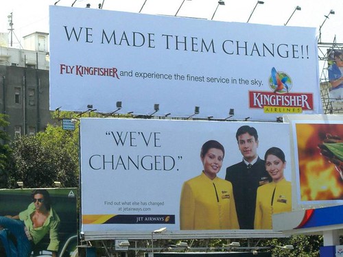
I have said this before – it is suicidal for a brand to admit to ‘change’. changed, improved, better, bigger… why, were they not so good earlier? Jet Airways proudly announced its new look – new crew uniforms, new corporate colors, new partner (Sahara) with an ad campaign that read – We’ve changed

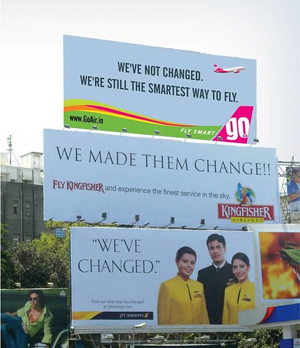
Kingfisher Airlines, louder and bigger in every way (if not actually better) put this hoarding up on top of that one – We made them change
And if you are thinking Jet was asking for it, and hey, good for Kingfisher, upstart Go went and did this…
A good slogan does not a good brand make – heck, it does not even make for a good campaign. Go for it, Go! is what I say – Go got it perfect – after all, what does Jet’s “change” mean for the consumer? And Kingfisher’s too, beyond the initial smile it evokes. The only other airline ad I can think of (in the Indian context) was Deccan’s Simplifly, a revolutionary concept at the time it was introduced. (On another note, what does any of this mean to the consumer given the sorry state of Indian airports and the “air traffic congestion” situation?)
This seems like a case of advertising to delight the advertiser rather than the consumer…
The Go thing is a photoshop job..There was no Go Hoarding above the Kingfisher one.
Kingfisher was the only one to have put up a counter copy FOR REAL ..!
The Go hoarding is the job of some “smart alec” creative guy who had nothing better to do with his PC.
Go hoarding, Real / unreal whatever… I believe change in anything should be internal and not only cosmetic.
Corporations who have ‘transformed’ (not changed) themselves to consumer needs have always stood the test of time.
Truth prevails……